Below is the plotted GHCN raw temperature data for Darwin, Australia during the period 1940-1970. I used the following query. Darwin has 5 duplicate raw records.
Station darwin = (from s in ghcn.Stations
where s.Name.Contains("darwin") select s).First();
Graph g = new Graph();
g.AddPlot(darwin.RawRecords[0], Color.Red);
g.AddPlot(darwin.RawRecords[1], Color.Blue);
g.AddPlot(darwin.RawRecords[2], Color.Green);
g.AddPlot(darwin.RawRecords[3], Color.Orange);
g.AddPlot(darwin.RawRecords[4], Color.Purple);
g.Render();
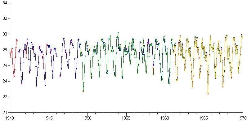
You can see that the duplicates are very similar, but obviously different enough that they were left as duplicates in the GHCN database. There are some missing values. Here is the full span of the raw data. One of the duplicates goes right up to 2010:
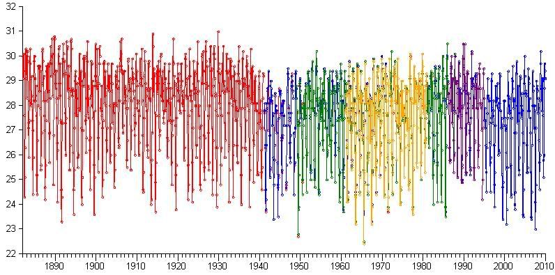
These plots are of monthly means. There are issues with generating annual means due to missing months that I don't really want to think about at the moment. I won't bother plotting annual means yet, I don't see the point. For calculating, say a linear trend, it will be safer for me just to stick to the monthly data.
Next I will add the ability to query the linear trend for a particular record over a specified period of time. It will then be possible to produce a list of stations ordered by temperature trend over an arbitrary period. I also want to be able to query for the extent of records, eg select only the station records that cover a certain period of time.
No comments:
Post a Comment