Sunday 4 April 2010

Wotts Up With That?

Over at WattsUpWithThat, Watt's is selling a $84.95 thermometer you can fit to your car. The idea is you can drive across the city and measure the UHI!

But wait...


Saturday 3 April 2010

March Madness

A website called ClimteCentral.org has recently published climate model projections for how areas of the US with monthly average temperatures below freezing are expected to shrink over time. This goes out to 2090 and there is the option to pick from two emission scenarios.

Here is an example of projection maps from the website based on the SRES A2 emission scenario:


Regional projections of temperature change under the A2 emission scenario are given in AR4:

http://www.ipcc.ch/publications_and_data/ar4/wg1/en/figure-11-11.html

Of some relevance to the article on the ClimteCentral.org website is a 2007 study by Meehl, Arblaster and Tebaldi, which finds that the number of frost days (number of days in a year when the temperature goes below freezing) in the US has decreased in recent decades and they attribute these changes as largely anthropogenic:


I haven't read the rest of the ClimteCentral.org website, it was drawn to my attention only because I saw Steve Goddard had attacked this particular article on WUWT, in a post on WUWT which concludes:

Based on the NCDC data, there is no evidence that increases in CO2 over the last 30 years have affected March temperatures in the north central region of the USA or moved the freeze line north. Once again, we see a case of scientists trusting climate models ahead of reality.

Goddard's conclusion (if true) would be specific to the ClimteCentral.org article rather than the peer reviewed literature on the subject (eg Meehl 2007), so offtarget of true relevance.

Steve Goddard describes the ClimateCentral.org article as "March Model Madness" and cites the following graph of mean temperatures of Winconsin Marchs since 1979:


He explains:
The orange line is the mean and the red line is the freezing line. Note that not only is there no trend towards a warmer March, but the standard deviation is high (3.67) and the range is also large – about 15 degrees difference between the warmest and coldest March.

Already I am thinking the ClimteCentral.org article covers a lot more area than Wisconsin (and the other state Goddard later looks at), so can Goddard's post really have much relevance to the ClimteCentral.org article? For the sake of argument I will just assume it can.

He asks us to note that there is no trend towards a warmer March, but how can we note that when he hasn't provided us a figure for it? The mean line, as far as I can tell, is literally the mean over the 31 year period (1979-2009). I plotted the same range of March mean data for Wisconsin from the (Wisconsin State Climatology Office) and also added a line of best fit:


Here's the same graph in Celsius:


There is a slight warming trend, it works out as about 0.08C/decade. I doubt it's statistically significant, but extrapolating that increase would put mean Wisconsin becoming about 0.7C warmer by 2090. The average March temperature of Wisconsin over the period 1970-2009 is about -1C.

Goddard justifies the start point in 1979 by saying
The reason to use 1979 onwards is because Hansen reports his trends from 1979 onwards. CO2 has increased quickly since about then, and that is also when satellite data came on line. 1979 is the year when GISS data turned sharply upwards, so it is a conservative time period to argue the thesis.

Goddard's words here are the real March Madness. What has Hansen got to do with this? Since when to skeptics copy what Hansen does? When Goddard says "the year when GISS data turned sharply upwards" Goddard refers to and shows the GISTEMP global-land temperature index. But what relevance does that have to Wisconsin? If such an "upturn" method made sense (it doesn't), wouldn't it make more sense to take the year when Wisconsin data turns sharply upwards?

As for co2 increasing quickly, what's special about 1979 that distinguishes it from 1970 or 1985? What's special about the year the satellite records start? None of this has any relevance to Wisconsin temperatures and none of this explains the start point of 1979 as anything other than arbitrary.

Could it be that this long nonsensical ramble of a justicication might indicate Goddard knew something more that he let on - that the choice of start-point makes a big difference to the result? Could he be merely constructing an odd justification for the choice of 1979 in case anyone checks?

I plotted the data from 1970:


The red line shows the best fit line from the previous 1979- graph. From 1970 there is a larger slope, 0.28C/decade. At that rate March in Wisconsin would be on average about 2.5C warmer by 2090. The average temperature of March in Wisconsin over the period 1970-2009 is about -1.1C. So the projection to 2090 using the start date of 1970 puts the average March temperature of Wisconsin easily above zero by 2090 (not that this is completely relevant to the climatecentral.org article anyway). These results are very different than if you start in 1979, so the whole method is likely a waste of time.

Imagine that an "alarmist" had chosen a start point with a long and weird excuse and then a skeptic had subsequently found that pushing that startpoint back a mere nine years revealed a very different result. We wouldn't hear the end of it!

Thursday 1 April 2010

It Might Be April 1st but This Is No Joke. Worst News Article In History?

I exaggerate. Or do I?

I saw an abysmal Fox News article criticized at http://wotsupwiththat.wordpress.com/2010/03/31/nasa-data-worse-than-climate-gate-data-giss-admits/.

Wow. Remember though. Fair and Balanced. Fair and Balanced.

How far out of your way do you have to go to "find" a story like this? It's just not the kind of thing that comes up in the day's reportable news events. It's not actually news. No this is a story someone has had to actively create as part of a political agenda. The agenda is obvious too.

I imagine a general rule of science journalism is not to get info for your news articles from political think-tanks. What the hell were Fox News thinking?

Have a read of another criticism of the Fox News article I found here too CEI's Horner enlists Fox News in manufacturing another climate email scandal

If you read the fox news article and then read the emails by Hansen and Ruedy you can see for yourself what straw grasping this news article is based on. I won't bother going into that - it's blindingly obvious. Skeptics wonder why investigations are clearing scientists of their accusations? The skeptics call whitewash, but the fact is that their accusations are based on them being idiots who fall for rubbish like this Fox News article. But enough of all that. I want to go through the article and comment on many things.

What's the first thing you think of when you think of NASA? Landing of the moon of course! So how better to start the article than a lame and rather reader-insulting attempt to tie the story in with a cheap quip about landing on the moon. And so it starts:

NASA was able to put a man on the moon, but the space agency can't tell you what the temperature was when it did.

Oh but Fox News can you be sure NASA did land on the moon? Perhaps next weeks fair and balanced story can discuss how NASA cannot explain shadows in moon photos.

By its own admission, NASA's temperature records are in even worse shape than the besmirched Climate-gate data.

Besmirched! What a crapper of a word to use. Why not say bastard instead? You know that bastard data that all those bastard scientists are always going on about.

"NASA's temperature data is worse than the Climate-gate temperature data. According to NASA," wrote Christopher Horner, a senior fellow at the Competitive Enterprise Institute who uncovered the e-mails"

Well all that tells me is X < Y and Fox News has told me that Y = Besmirched. If only I was reckless enough to put imaginary values to those variables I might actually fall for whatever unfolding scandal Fox News thinks it's reporting.

Horner is skeptical of NCDC's data as well, stating plainly: "Three out of the four temperature data sets stink."


Horner is skeptial of NCDC's data as well? I might faint I am so shocked. I have a hunch that Horner would be skeptical the Earth is round if that could be construed as supporting global warming. One thing that is a little surprising is that Fox News is not skeptical of Horner.

We are given more code though - we learn, from Horner no less, that three out of the four temperature data sets stink. What are these four datasets? Lets see, they've mentioned CRU, NASA and NCDC so far. Hmm that's odd that's only three. I guess these are the ones that stink. So what's the squeaky clean one not mentioned? It can't be UAH because that would mean they were pretending RSS doesn't exist...

"Global warming critics call this a crucial blow to advocates' arguments that ..."

This is the fair and balanced part where they bring in the as yet unrepresented other side - the global warming critics...er, wait..... Hang on thought we just had the global warming critics represented by Horner? Oh I suppose he isn't representing the critics at all. He is just what the media would call an "independent voice". It's just coincidence that he is an unbiased senior fellow of a political think-tank, which has got itself involved in some nitty gritty detail of some sub-sub-discipline of a particular scientific field because....well because the CEI is very interested in science. Nothing to do with politics. Next week they will be investigating special relativity and the germ theory of disease and I am sure Fox News will be there to report it...

The CEI are afterall just the kind of entity any reputable media organization should get it's science news from. That makes complete sense. It's not bizzare at all.

Global warming critics call this a crucial blow to advocates' arguments that minor flaws in the "Climate-gate" data are unimportant, since all the major data sets arrive at the same conclusion -- that the Earth is getting warmer. But there's a good reason for that, the skeptics say: They all use the same data.

But Fox News, how can NASA and CRU use the same data when Phil Jones has the only copy and deleted it? Ah the plot thickens. And what about your 4th dataset (the squeaky clean one). Does that use the same data? Does it arrive at the same conclusion?

"There is far too much overlap among the surface temperature data sets to assert with a straight face that they independently verify each other's results,"

They use temperature data from the same stations? I can't imagine why! We must immediately get them to use different stations! Just promise you won't turn round and exploit that by spreading a nasty rumor that NASA deliberately excluded valid stations from their analysis and only kept the warm ones! Actually no need to promise I am sure skeptics wouldn't stoop so low.

Just one more thing. Who made the argument that there is too much overlap?

says James M. Taylor, senior fellow of environment policy at The Heartland Institute.

Ah yes the Heartland Institute. Another political think-tank...er I mean another reputable science source that any journalist writing a science article should get their information from. Like the Competitive Energy Institute, the Heartland Institute are only interested in this subject because they enjoy science. Next week the Heartland Institute will be organizing an international quantum physics conference.

Again I repeat that it is not at all bizzare for a major news organization to be getting it's science information from "senior fellows" at political thinktanks.

"Neither NASA nor NOAA responded to requests for comment."

Shit, That means no more material to quotemine from. All you have is Hansen's email and his draft paper to quotemine.

Here comes the token balance:

But Dr. Jeff Masters, director of meteorology at Weather Underground, still believes the validity of data from NASA, NOAA and East Anglia would be in jeopardy only if the comparative analysis didn't match.

That silly Jeff Masters, he "still" believes the science is okay even though Fox News has said otherwise. I won't quote it all, there's a few sentences. Masters finishes with:

This should give us confidence that the three groups are probably doing reasonable corrections, given that the three final data sets match pretty well."

The Fox News article then continues with:

But NASA is somewhat less confident, having quietly decided to tweak its corrections to the climate data earlier this month.

So they brought in Jeff Masters simply to provide a facade of "balance". But no sooner as he is done they wildly misinterpret the Hansen et al 2010 draft paper which contains updates to the GISTEMP analysis as meaning NASA are not confident that the "corrections are reasonable". Also what the hell is the "having quietly decided" part about? How do you quietly decide something? Do you make noises while you make a decision? How about publishing a paper? Is that quiet?

There's no defense for such claims, let alone putting them in a news article which is supposed to be "fair and balanced". It's steeped in an agenda to discredit GISTEMP with flimsy arguments. It's not fair or balanced at all.

I don't think this is the kind of stuff a fox news author will know about anyway. It's too specific. Am I to really believe that they've found the draft paper on James Hansen's site and understood it? No I don't buy that for a second. Either they are reading something off a skeptic blog, or there's some CEI or Heartland Institute like person ghost writing this information for them.

So they quote CEI and Heartland Insititute "senior fellows" and balance that with Jeff Masters, but all the text in-between is more skeptic crap. Ie the article is riddled with skeptic bullshit with a few token Jeff Masters sentences in the middle, the middle because they can't help but follow up by trying to dismiss what he says. That's unbalanced. In fact including Jeff Masters just makes it worse because it's exactly what you would do if you were trying to create the mere illusion of balance without actually providing it.

In an updated analysis of the surface temperature data released on March 19, NASA adjusted the raw temperature station data to account for inaccurate readings caused by heat-absorbing paved surfaces and buildings in a slightly different way.

"A slightly different way" is not good enough. Did it make a big difference to the results or not? If not then how can you claim the change means they are "less confident" than Jeff Masters in the data? This Fox News article is complete bullshit. They might as well just hand over the website to Watt's or Joe D'Aleo and say "here you go, write some shit, we'll throw in a few sentences from Jeff Masters and call it fair and balanced". For all I know that's what they did.

But wait it gets better, after using the adjustment updates in Hansen 2010 to imply NASA are less certain in their results than Jeff Masters, they can't help but add:

Of course, this doesn't solve problems with NASA's data, as the newest paper admits: "Much higher resolution would be needed to check for local problems with the placement of thermometers relative to possible building obstructions,"

They've even cherrypicked a sentence from the paper! Someone has gone through the paper an used the common anti-scientific act of quote-mining stuff.

And it gets better!

a problem repeatedly underscored by meteorologist Anthony Watts on his SurfaceStations.org Web site. Last month, Watts told FoxNews.com that "90 percent of them don't meet [the government's] old, simple rule called the '100-foot rule' for keeping thermometers 100 feet or more from biasing influence. Ninety percent of them failed that, and we've got documentation."

Old simple rules!

It continues to get better:

Still, "confidence" is not the same as scientific law, something the public obviously recognizes.

Confidence is not the same as scientific law? What the fuck. That sentence doesn't even follow from anything, let alone make sense.

According to a December survey, only 25 percent of Americans believed there was agreement within the scientific community on climate change. And unless things fundamentally change, it could remain that way, said Taylor.

Is Taylor saying 25 percent is too low or too high? By fundamental change is he expressing a hope for more shit articles to be published in the media to bring the % down.

No he means:

"Until surface temperature data sets are truly independent of one another and are entrusted to scientists whose objectivity is beyond question, the satellite temperature record alone will not have any credibility," he said.

He cares. But what does truely independent mean? That they use completely different temperature scales? That they are not all on Earth? What does objectivity beyond question mean? How is that even obtainable? Your statement makes no fucking sense. It's not practical, it's meaningless toss.

This is why we employ scientists to do science, not pie in the sky "senior fellows" of think-tanks who...well who knows what you do.

And isn't there more than one satellite temperature record Taylor? Yes there is.

Then the article ends.

Out of Breath after a Swift Hack?

Announcing the final nail in the coffin of AGW is a common skeptic argument. There are many variants. Some skeptics will tell you outright the "theory is dead". Some just sadly inform you that "it's over". Others helpfully suggest you can just "give up" (stop making it so hard on yourself!). Amusingly some even think they can pull a fast one on you by saying something like "what shall we focus on now that the co2 theory is dead?".

It's as if they believe it possible to talk a theory to death.

This goes back before climategate even though climategate did see an increased usage in this (and all) skeptic arguments. This kind of behavior of announcing the end of a scientific theory is not an unprecedented tactic of anti-science groups.

I am going to do something similar and predict the imminent demise of climategate. It's over dudes. Like some natural cycle it just reversed. Move on. What will you focus on now that climategate didn't work?

Depressing. Seems some of them really believed climategate would be the "final nail in the coffin of AGW"

What was climategate? (like how I slipped in some past tense there?) It was more than just hacked CRU emails and data, it was mostly in fact skeptic interpretations, imaginations and topics from their past blog posts. The skeptics made sure to take every thread from the hacked emails and data they could find, but they also redoubled their efforts at smearing scientists, science institutions, surface temperature records, etc. They gave it their all - threw it all into the mix. Tried to create one massive "climategate" reason to dismiss all the science. Annoucing the end of the "co2 theory" as they sometimes put it, was a heavily invested goal.

Except we knew that wouldn't work because it was a facade. A facade that would have misled many of the public. But a facade nonetheless. It was layer upon layer of desperately bad arguments. Grasping at straws. There were good criticisms to make concerning the CRU emails and data, but they weren't nails in the coffin of manmade global warming - so not enough for the skeptics. They wanted something mega, so they span it up like crazy. They sprinted.

Now the skeptics cannot keep up that momentum, and worse the damage they have left behind is catching up with them. It must have been very exciting to have the spectre of "pending investigations" to spin, but it's not so exciting anymore when those investigations start to reach their climax..

The skeptics will be quick to complain that the investigations didn't look at the right emails, or the right data or the right arguments. The problem though is that skeptics created a cloud of rubbish arguments. If they had a point, they should have reduced the noise and just made a few clear arguments.

It was fun while it lasted. Now climategate is running out of steam. They've had their sugar rush and now they are descending into the dumps. Depressing.

Sunday 21 March 2010

GISTEMP attacked again

In recent days the accusation has been raised on "skeptic" blogs that GISTEMP has adjusted out the true extent of cooling from 1940-1978.

The accusers cite the image in the 1976 national geographic, which shows a large decline in temperature from the 1940s to the 1970s. The claim is that GISTEMP has erased much of the cooling seen in this 1976 national geographic imagine and even that Hansen has reduced the cooling over various versions of GISTEMP's history.

Below is the comparison image used which shows the red and blue lines drawn haphazardly on the images to convey a change in the data:


This is the original article
http://hidethedecline.eu/pages/posts/decline-temperature-decline-1940-78-the-cold-data-war-170.php

The accusations have then spread all over the skeptic blogs:
http://joannenova.com.au/2010/03/the-mystery-deepens-where-did-that-decline-go/

http://wattsupwiththat.com/2010/03/18/weather-balloon-data-backs-up-missing-decline-found-in-old-magazine/

And to less well known places:
http://wallstreetpit.com/20710-climategate-goes-back-to-1980

As usual though it's not the analyzers who make the strongest accusations, it's the blogs down the line who link to each other and heap on more and more libelous smears as they go. I even had one commenter on the Joannenova blog direct me here: http://hennessysview.com/2008/07/23/dr-james-hansen-of-giss-is-a-liar-and-a-fraud/. Through that descent into madness I may be getting close to the hideouts of the folks that send death threats to scientists.

GISTEMP 1980


The underlying graph is derived from Hansen et al 1981 (PDF) although the hidethedecline.eu references the image in this NASA article. The paper doesn't really discuss the graph data much, I guess this is proto-GISTEMP. But the paper does strongly suggest that the graph is of meteorological stations. Ie no sea surface temperature input.

Hansen et al 1981 also shows the data for different latitude bands:


Suffice to say it's clear that the Northern latitudes exhibit a larger 1940s-1970s decline than the global record.

Hansen/GISS 1987


Not referenced. Hansen et al 1987 perhaps? The graphs in there don't quite match this one. Here are the graphs from Hansen et al 1987. These are for meteorological stations only:


Comparisons with modern GISTEMP

There is of course a difference between global GISTEMP using land from meteorological stations only, and global GISTEMP using meteorological stations plus sea surface temperature.


It is necessary to compare the old GISTEMP graphs with the right modern type. In this case the one using meteorological stations only.

Comparison of Hansen et al 1987 graph (blue overlay) with current global GISTEMP based on meteorological stations:


Comparison of Hansen et al 1981 graph (blue overlay) with current global GISTEMP based on meteorological stations:


This overlay stuff is all rough eyeball stuff, but there is little difference here o get worked up about. GISTEMP does not show any change in the period 1940-1970 over it's history that deviate from what can be expected from changes in the algorithm, input data, etc. It even coincidentally seems to be within the error bars anyway. Much fuss about nothing.

On the last image notice that the modern GISTEMP image shows a large rise starting just before 1980 while the 1981 image shows (up to 1979) flat. decline.eu says:

"not only did Hansen alter the trend 1940-75, he also made a HUGE adjustment around 1975-80, much more warming trend in 2007 compared to 1981."

This is incredibly unlikely. Just how could one scientist engineer in a HUGE adjustment like that without anyone else noticing? Let alone getting it to stick. How would he even do it? He cannot alter the underlying met station data afterall. Can you not think of better reasons for the difference? I notice for example that the 1980 graph is plotted with a 5 year running mean, so potentially that is the problem as the end points of the Hansen 1981 graph will be affected.

The 1976 National Geographic graph

This is where the real disagreement is. GISTEMP and HadCRUT disagree with the following National Geographic graph:


This graph uses data from Budyko 1969 (PDF) up to 1960. The final part past 1960 is produced from radiosonde data. It's the final bit involving the radiosonde data where the substantial disagreement with GISTEMP and CRU is (and raw GHCN...). While there is some disagreement between the Budyko data and the GISTEMP and HadCRUT data, I think that could be explained by the following.

The Budyko data is described in detail in Rockboc 1982 (PDF). The summary reads:

A Russian group under the initial leadership of M. I. Budyko, has produced the first analysis of monthly average surface temperatures for the North-ern Hemisphere on a 5x10 latitude-longitude grid. This data set and the magnetic tape of the data are described in this report. The Russian data set is the first and only available digitized, gridded collection of monthly average Northern Hemisphere surface temperature data. The quality of the data over land, especially for recent periods, should be excellent and useful for many studies of climate. The quality of the data over oceans is questionable, and, unfortunately, it will not be possible to objectively determine the quality by a reanalysis. I would recommend to some-one interested in data over the oceans, to either acquire data based on ship measurements (e.g., Pal-tridge and Woodruff, 1981) or wait for the analyses of the Climate Research Unit or GISS. These later analyses will be able to include an analysis of the quality of the data over the oceans, and the depen-dance of the results on the analysis technique used. I expect the analyses of the Russians over land to be very similar to those of these other two groups.

Note the concern about the ocean part of the analysis and the suggestion that GISTEMP and HadCRUT may provide more accuracy here. The paper also notes that
"few data were available for this period south of 20N and near the North Pole, so it was not really a hemispheric average."

Jones 1986 (PDF) mentions regarding the same Russian data:
"The Russians extrapolate their analyses over the ocean areas of the Northern Hemisphere, even though only isolated island data are available. This procedure is dubious and gives a false impression of the true data coverage."

That's plenty of reasons to think that the later analyses by CRU and GISS might find different results. I think it's important to look at papers published in the 70s and early 80s to figure out exactly when and why the changes occurred as scientists typically discuss differences between their results and the results of others. I was looking for Jones 1982 earlier which apparently reviews earlier Northern Hemisphere temperature analyses, but couldn't find a PDF.

To give a case in point as to why the above issues might affect the results, take HadCRUT and CRUTEM. Hidethedecline.eu has a post dedicated to the National geographic graph in which they compare HadCRUT3 Northern hemisphere with the national geographic graph.
http://hidethedecline.eu/pages/posts/temperature-corrections-of-the-northern-hemisphere-144.php

But if you use CRUTEM instead (land only), there is little disagreement through the Budyko data 1940-1960 (this overlay is y-aligned arbitrarily)
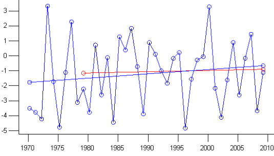
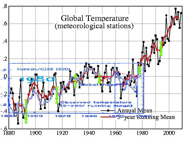
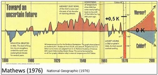
So inclusion of ocean data would seem to make a big difference. If Budyko is strongly reliant on land data then this could explain the difference.

As mentioned earlier the national geographic graph uses radiosonde data after the Budyko data ends. That's where there the big difference is. I haven't looked into this yet. I was hoping to find Jones 1982 and possibly some earlier papers which may shine light on the subject.

The bottom line for me is - why drag GISTEMP and HadCRUT into this at all?

The raw station data is out there and available. If skeptics think the 1970s show more cooling than GISTEMP and HadCRUT show, then by all means demonstrate this using the raw station data.

Tamino has already looked at the raw station data and the result has been reproduced by others too.


http://tamino.wordpress.com/2010/03/05/global-update/

The 1940-1970 decline in the raw station data is not as pronounced as the national geographic article. It's absurd on the face of it to accuse GISTEMP and CRU of hiding a decline which doesn't show up in the underlying station data they use.

Thursday 11 March 2010

Cryosat 2 - "Liftoff probably won't occur before early April"

Looks like they are busy fixing problems. It was previously scheduled to launch on the 25th February.

"CryoSat 2 is first in the queue, but liftoff of the ice observation craft from Baikonur probably won't occur this month due to the late discovery of a performance issue with the Dnepr's second stage steering system."

http://www.spaceflightnow.com/news/n1003/10dnepr/

Sunday 7 March 2010

SMHI and Phil Jones

Stockholm Initiative Called Out Over False Accusations Against Phil Jones

Stockholm Initiative delivers false statement about parliament enquiry

http://climateaudit.org/2010/03/05/phil-jones-called-out-by-swedes-on-data-availability/

The false statement is not made by the SHMI, but a body calling itself the "Stockholm Initiative". This is important to note, because the way it has been presented on certain blogs has mislead some people into thinking the false statement, with it's rather colorful phrasing, was made by the SHMI itself or another neutral Swedish science organization.

The press release containing the false statement actually comes from a body calling itself the "Stockholm Initiative" (Take a look at their website). Comparisons could be made with the Heartland Institute, although the Stockholm Initiative seems slightly more credible.

The opening words of the Stockholm Initiative press release contains a false statement attributing a statement to Phil Jones that he did not make. It wasn't Phil Jones who mentioned the data availability issue with the SHMI, it was the Professor Acton who was present alongside Phil Jones the parliamentary hearing (see the transcript of the hearing - http://www.publications.parliament.uk/pa/cm200910/cmselect/cmsctech/uc387-i/uc38702.htm). This is a very strange and disturbing kind of error given that the transcript is very clear on who said what.

This is not the only error however. The following blog post outlines "many factual errors" that are contained in the SHMI press release:
Climate sceptics are wrong about Phil Jones and SMHI

This press-release have gained considerable attention on climate denier blogs but contains many factual errors. To begin with swedish data is not in the public domain. SMHI have recently made some data available on the internet for non commercial use, but under the explicit condition that the recipient is not allowed to disclose the data.

The license agreement is very easy to find, and if you are able to read swedish the license agreement can be read here. Paragraphs §3.2 and 4.1 are the relevant ones and here's a rough translation of §4.1
4.1 The Licensee does not own the right på disclose, send on, link to or in any other way spread the contents of the data and/or products that has been recieved in accordance with this agreement to a third part.
This is not public domain.

But it is however standard policy for SMHI, and for most of the european wheather organisations. There are even some sort of common guidelines for this sort of thing. The SMHI and others are allowing scientists free access to their data, but they are not allowed to re-publish the data.


See also http://scienceblogs.com/stoat/2010/03/weird_stuff_from_the_swedes.php)

The Stockholm Initiative have not commented and clarified a response to their errors or explained how they came about. I only hope they step forward to clear matters up, or else I fear the world will not trust anything they say again. This is of course a very important subject and it would be a shame to see the reputation of such fine organizations as the Stockholm Initiative tarnished..